
Stop using buttons as links
A look at the UX of links and why programmatic navigation should be avoided
Links are perhaps the most fundamental of all features of the Web. They've been around since day zero. All browsers support them. All users understand them.
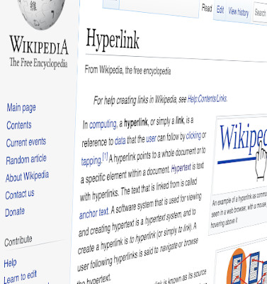
They are surely the most-used interactive element on the web. Through the experience of interacting with millions of links, users have built a deep and intuitive understanding of how they work. So when a link behaves in a way that is contrary to their expectations, it is an unsettling and deeply frustrating user experience.
Recently when using a major website, I saw what looked like a link and CTRL-clicked on it to open its destination in a new tab. To my annoyance, this did not work. Instead, the content of the current tab was replaced.
It turns out the author had decided not to use an HTML link for this navigational component, but instead some other element upon which they'd attached a click listener to trigger a programmatic navigation.
What is a link?
To be clear, this discussion has nothing to do with design.
When I refer to links, I mean the HTML <a> element (a.k.a., an anchor tag) with an href attribute. This does not just mean inline text links; HTML links can have any visual appearance and almost any content. For example, a link could be styled with CSS to look like a button, or it could contain just an image and no text content. This is fine; it's still a link as it's marked up with <a href="...">.
Back in the HTML 4 days, the a element was defined as allowing only inline-level content. This greatly restricted what could be marked up with the anchor tag to make a link.
In HTML 5, however, the a element is defined as having a "transparent" content model, meaning you can put anything in it that would be acceptable as a child of its parent element (with some restrictions regarding interactive content).
What is programmatic navigation?
It's not just the HTML anchor tags that provide authors with a mechanism for allowing their users to navigate around the web; JavaScript lets us programmatically direct the browser to a new location, too. That could be by interacting with the window.location object to change the current URL, or even just changing the scroll position of the document to bring a particular section into view.
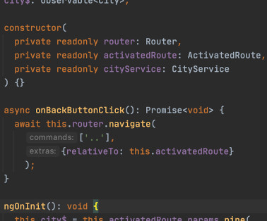
We can therefore make anything on a web page behave similar to a hyperlink by attaching click event listeners to anything in the DOM, be that buttons, images or whole blocks of text, and programmatically navigating when those events fire.
Using scripting like this to redirect the user is what I'm referring to with the term programmatic navigation.
Just because you can, it doesn't mean you should
It may seem a strange thing to have to point out, but every single browser supports HTML links. Furthermore, they offer their users a bunch of ways in which they can interact with links. So when a website author decides to not use a native HTML link (i.e., an <a href="..."> element) and tries to reinvent the functionality with their own bit of programmatic navigation, they're taking away these browser-native features from their users.
Take, for example, the button-as-a-link scenario. As mentioned above, a user may want to open a link in a new tab and try holding down CTRL or CMD when clicking the "link" to do this, only to find this browser-native way of opening links in a new tab for some reason did not work for this particular link, and the page they were viewing has been replaced with a new one when they did not want it to be. Ok, it's not the end of the world, but unexpected behaviour like this in a user interface is an extremely frustrating user experience.
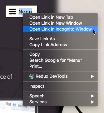
This is far from the only browser-native feature that gets lost by not using an HTML link. For example, the browser will not provide the same context menu on right-click (or equivalent for the user's system) as it would have done for an anchor tag. So visitors can no longer, for example, 'copy link address' should they wish to paste that link elsewhere.
And of course, it's not just browsers that inherently understand what an HTML link is. Assistive technologies like screen readers, as well as web scrapers, search engines, or any other software, will understand the semantics of an HTML anchor tag, but not a click listener attached to an arbitrary element.
Internal navigation
HTML also has a native solution for internal document navigation; the fragment of a URL can be set to the id of an element on the page to scroll to that element. It's also possible to programmatically change the scroll position of the document element to achieve the same thing.
But again, the HTML-native method has several advantages.
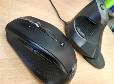
For a start, it adds an entry to the history stack, so the browser 'back' button will return the user whence they came. (And it's not just the browser that has a back button; keyboards and mice may also have them.)
Then there's all the aforementioned features of native links, such as the ability to bookmark, share, open in a new tab, activate a link-specific context menu, etc., which apply equally to internal links.
Other types of navigation
Another form of internal "navigation" is opening up a full-viewport overlay to show, for example, a large version of an image or video (e.g., in a lightbox modal).
The site mentioned at the start of this post that irked me so with non-native links also caused me frustration by not adding to the history stack when it opened such a modal. I instinctively tried to exit the modal using the back button under my thumb on my mouse, only to be taken a few clicks' worth of navigation further back than I'd expected.
This scenario is an interesting one because some scripting is inevitably needed to control the visibility of the modal, and it may seem that there isn't a dedicated native HTML way to handle this.
However, there are techniques we can employ to drive the state of the modal using the URL, and thus gain the benefits of being able to deep-link into its visible state, and all the UX goodness that links and history navigation bring.
For example, the visibility state could be driven by the fragment of the URL, together with an onhashchange event listener that handles changing the modal's visibility as appropriate. If the url ends with #idOfModalElement when the listener is invoked then show the modal, otherwise hide it.
<!-- A trivial illustration of how to drive a modal's state using the URL fragment: -->

<p><a href="#fullPageModal">Show modal</a></p>

<div id="fullPageModal" style="display: none">
  <p>Hello, world!</p>
  <p><a href="#">Close</a></p>
</div>

<script>
(function(){
  const modal = document.getElementById('fullPageModal');
  const toggleModal = () => {
    if (location.hash === '#fullPageModal') {
      modal.style.display = 'block';
    } else {
      modal.style.display = 'none';
    }
  };
  // Toggle the modal state when the fragment changes
  window.addEventListener('hashchange', toggleModal, false);
  // Run immediately in case the initial page load included the #fullPageModal fragment
  toggleModal();
})();
</script>
Alternatively, if you're using an SPA framework like Angular, you can use the framework's routing mechanism to show/hide the modal based on URL path changes.
Always prefer native techniques
Links are such an intrinsic part of the web, yet it can be very easy to take the UX of navigation for granted.
If you want your link to look like a button, that's easy; just style it that way with CSS. If you want your link to be an image, that's easy; just stick an img inside an a element, or again, use CSS (and include appropriate accessibility mark-up for users of assistive technologies like screen readers).
Ultimately, wherever HTML offers a native implementation (be that for navigation or anything else), it should always be preferred over rolling your own solution.
So please, avoid surprising and frustrating your users. Always use native links for navigation.
Support
If you've found my blog useful, please consider buying me a coffee to say thanks:
Discuss
Comments or questions? Join the conversation on Twitter: